Final Project
Christoffer Relander
Born December 1986
Born December 1986
- Christoffer Relander was born in Finland, growing up in the Ekenäs countryside. He served in the Finnish Marines between 2008-2009, afterwards developing an interest in photographer. He has won multiple awards and has attended multiple exhibitions. He has gotten enough recognition to do commissions for major companies like Nikon and Adobe.
- This artist focuses on double exposures. Most of his double exposures are of animals or plants. Quite a few of the showcase images are portrait shots. Sometimes the background of the double exposure is not just white, it has some texture to add to the life of the image. A large amount of his images are in black and white; when an artist does this they focus on the texture and lighting as color can often distract from such details.
- I believe Christoffer Relander intentions in his artwork is to create a link between nature and mankind. I believe he wishes to show us the beauty of nature and the exotic ideas and life that it contains. If you look at his images they either comprise a human and natural image or two separate natural objects. Most all have a sense of unity and are well composed. The images have an almost primal appeal, no machine or advanced technology is present. They deliver a message while still remaining simple yet detailed.
- The first thing I noticed about his double exposures are the borders. The edges of the double exposures are softer, no solid lines. Some of the borders are even blurred or have a reflected light on them. This made me look at my own double exposures; most have solid lines and rough edges. No smoothness, No reflections just an overall rough, unfinished image. Looking at these images made me realise the unfinished quality my pictures had, it made me think more about the finished image.

Photo by Christoffer Relander
http://www.christofferrelander.com/projects/we-are-nature/ https://static1.squarespace.com/static/556832e1e4b0622d21b5d76a/582edf3759cc68e27c189780/582ef0596b8f5b2f729e8a7a/1479471196854/multiexponering-51.jpg?format=1000w |
Nature's Shadow
The image of a tree hidden within a shadow caught my attention. It is such a simple double exposure, but so much detail can be placed into it. I did not know what tree to use in my photo so I took a picture of the one I though best suited the ascetic of the image. The color was easy to remedy as the image is black and white. Pavement is easy to come by and served as a good canvas for the double exposure.
|
The posture of the people in the image is similar but not quite aligned. The clothes worn were different as well, the photographer on the left not having a collard shirt. Both images are in black and white, yet the color pallet used is not quite the same. The image on the right being more frigid and pale. The physical properties of the images are different; the one on the left being square and the image on the right being landscape in layout.

|
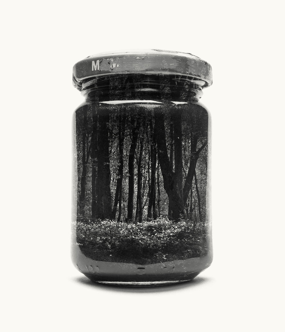
Forest in a Jar
The jarred displacement was another art form that caught my eye, unfortunately the only jar I had on hand is one of unorthodox proportions. Thus the shape is not quite alike nor is the image neat. The forest I live by does not have that much undergrowth either, making it hard to find a matching image.
|
The resolution and overall composure of the images are vastly different. Choosing a honey jar was a massive mistake on my part as it is hard to isolate the edges of the container in Photoshop. The detail of the image on the left is not lost or muddled unlike the image on the right. The left image is also missing its lid. The forest each jar contains is different as well. The one on the left focusing on the trunks and undergrowth, the one to the right focusing on the canopy. Both images however are in black and white.

Photo by Christoffer Relander
http://www.christofferrelander.com/continuumplateau1/ https://static1.squarespace.com/static/556832e1e4b0622d21b5d76a/582ef1cbcd0f688e8f5009ef/582ef1e1f7e0aba17094fe58/1479471587416/Hand-Built-World.jpg?format=1000w |
Reach
The hand reaching towards some object in the distance again, caught my attention. As a climber I interpreted the meaning of this images showing the struggle of an ordeal, progressing towards some distant goals by slowing pacing yourself. The rocks inside the hand also helped with the idea. I chose to take a different path than the artist and added a cloudy, slightly muddles background. This adds to the idea of reaching for some goal.
|
I believe the hand used in each image comes from a different perspective. While the hand on the left belonged to another person and was taken by a photographer the hand on the right is the photographers own hand; this changes the angle of view of the image. The rocks within the hands are different, the one of the right likely comes from some stone wall, covered in lichen. The one on the left comes from the side of a river. Both hands have their fingers curled and both images in black and white. The right image however, has a non-white background.
